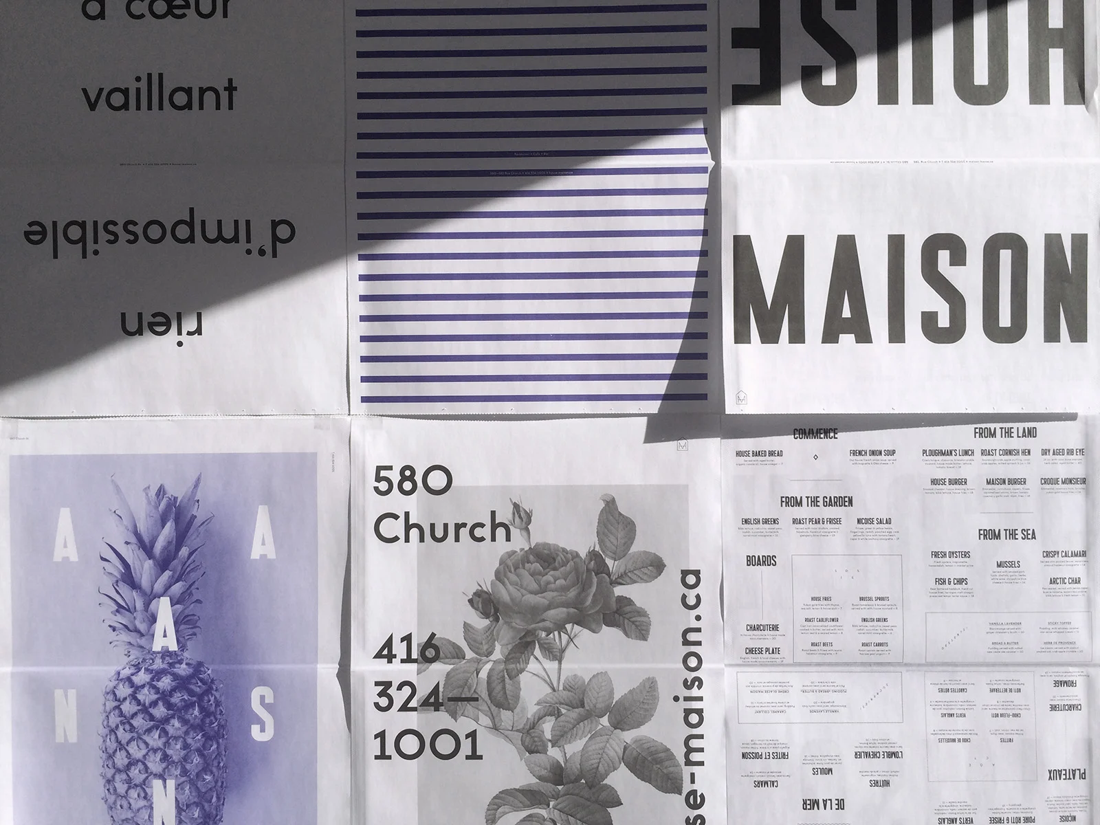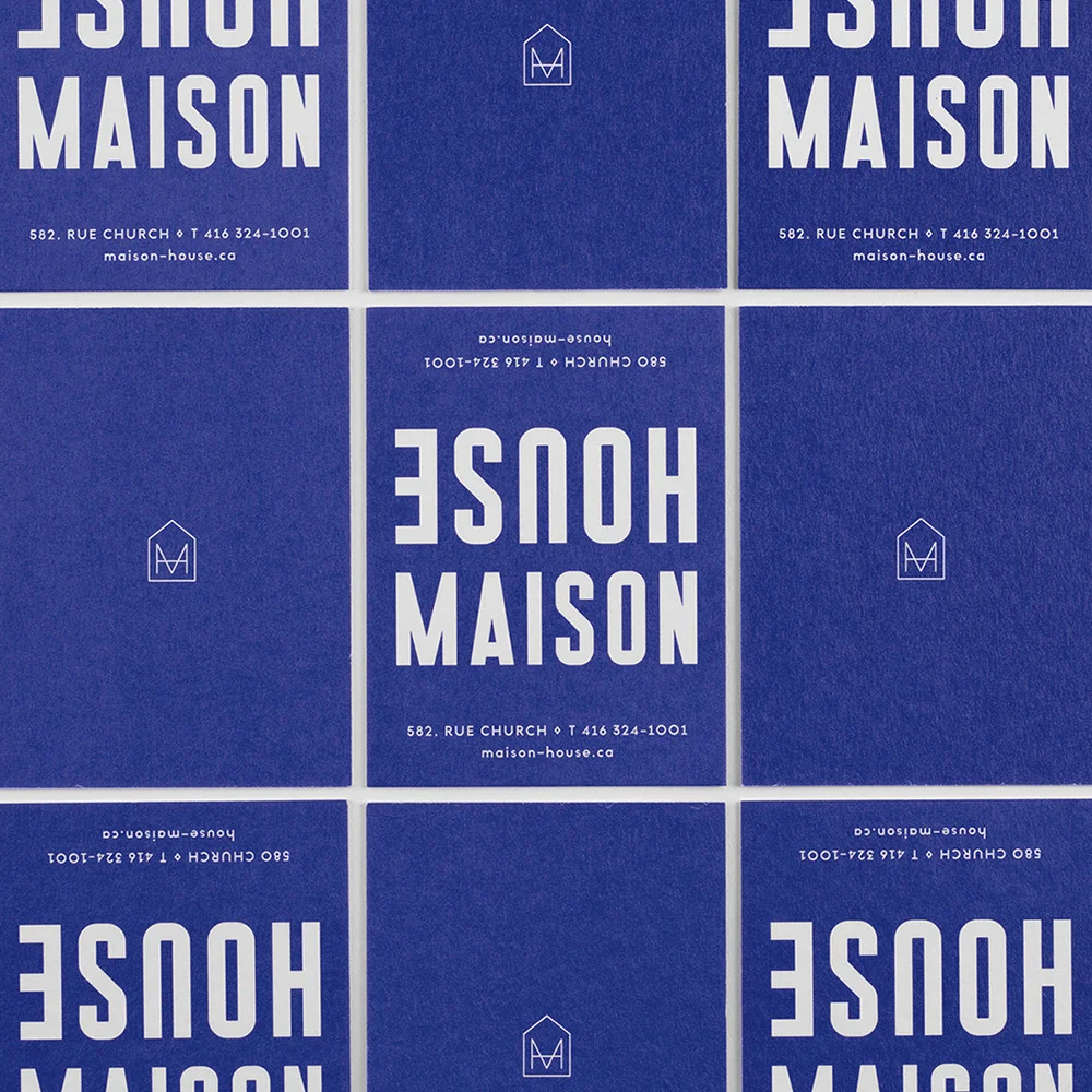
House Maison Restaurant Branding
Branding for a pop-up restaurant inspired by the two dominant cultures that shape Canada: the English and the French. Inverted typography highlights the bilingual nature of all printed collateral. Scone or croissant? Tea or café au lait? Chips or frites? Bon appétit! Designed at Leo Burnett Toronto.