Museum of Contemporary Art Branding
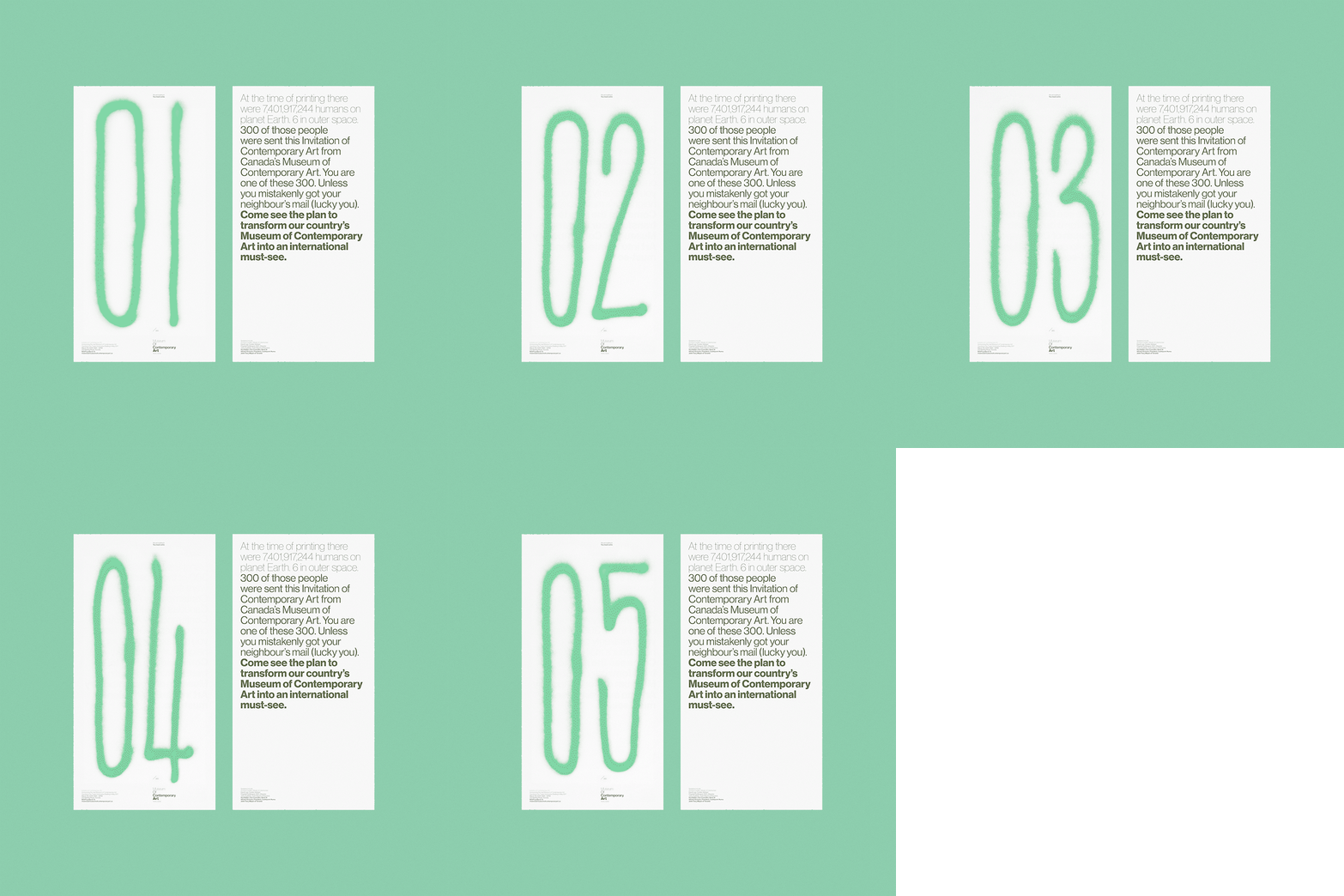
The primary brand elements created for MOCA were inspired by the factory building that is the museum's new home. The distinct varying weight of the logo typography mimics the descending thickness of the mushroom pillars that transition from thin on the top floor down to extremely thick on the ground floor. The colour palette was inspired by the factory green that was abundant throughout the building. Designed at Leo Burnett Toronto with Jeff Watkins and Man Wai Wong. Copywriting by Steve Persico.


